Client — FC Balkan Eagles (formerly FK Internacional)
Services — Brand identity + logo design
Year — 2024
Services — Brand identity + logo design
Year — 2024
Project overview
I was tasked with reimagining the brand identity for Balkan Eagles, a Montenegrin soccer team seeking a fresh, professional image to align with its ambitions. The previous branding lacked cohesion and identity, providing an opportunity to build a bold and uncompromising new visual system from the ground up.
The new minimalist color palette of black, grey, and white communicates the team's mature and refined identity. At the core of the identity is a sharp and dynamic eagle logo—a powerful symbol of pride and resilience—designed with clean lines for versatility across all touchpoints.
This rebranding establishes a sense of self for the team, aligning its visual identity with its aspirations and positioning it as a competitive force in the league. Deliverables included the logo, team name, typography system, and a cohesive visual language to set the foundation for future growth.
Above — Full logo
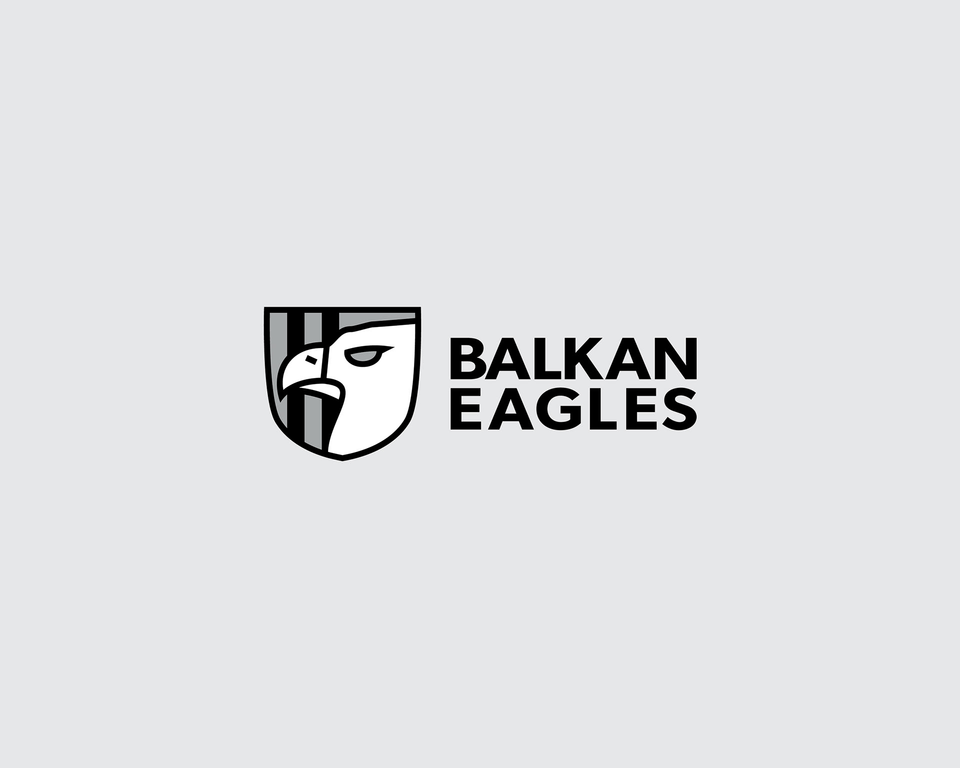
Top left — Horizontal logo
Top right — Logomark
Center — Logotype
Bottom — Vertical logo
Top right — Logomark
Center — Logotype
Bottom — Vertical logo
Tone words by color
Black — Bold + Sophisticated + Uncompromising
Grey — Sleek + Secure + Mature
White — Minimalist + Fresh + Refined
Grey — Sleek + Secure + Mature
White — Minimalist + Fresh + Refined
Below — A look into the brand guidebook

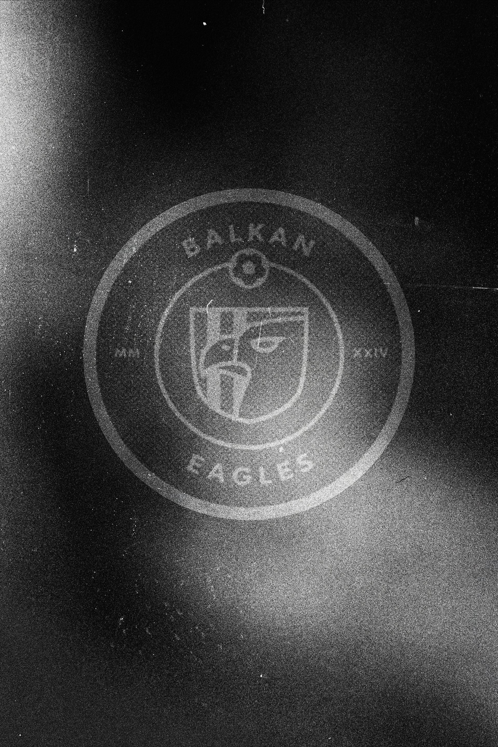
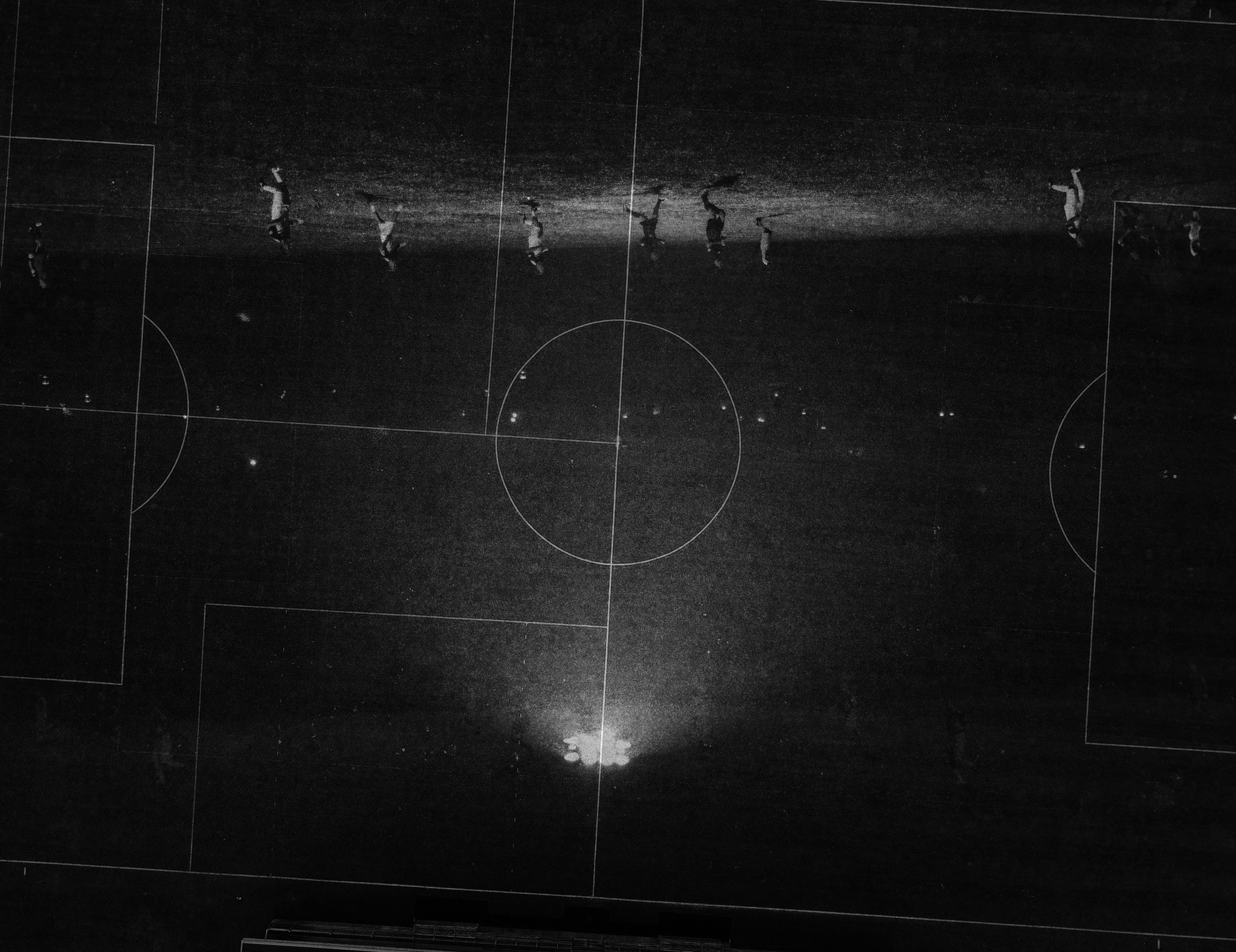
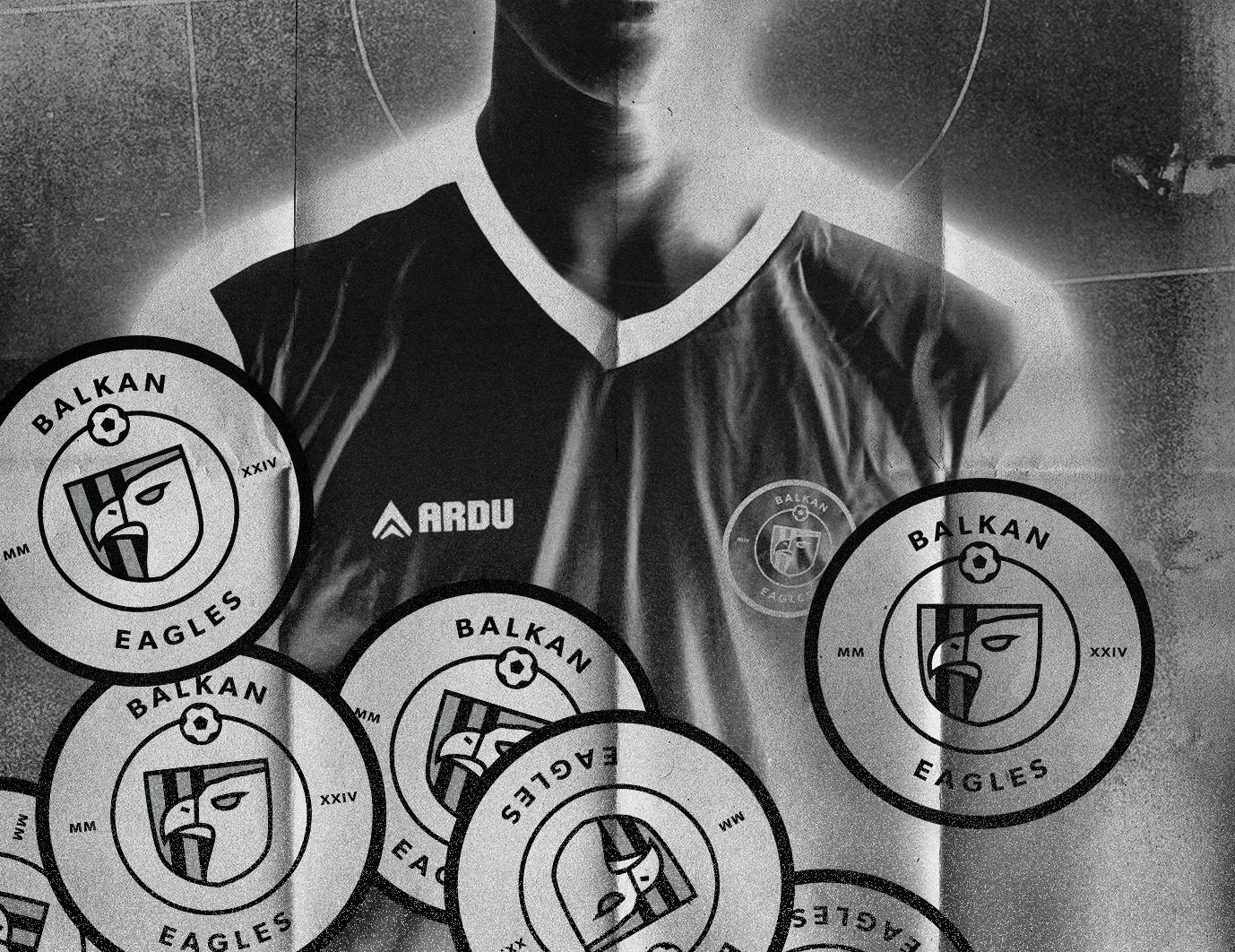
Visual exploration + digital emblem test using the team's original FK Internacional jerseys
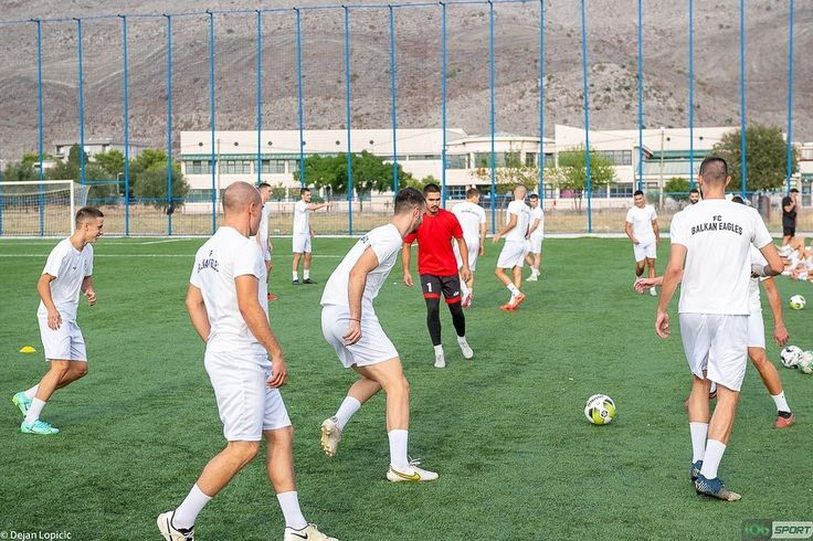
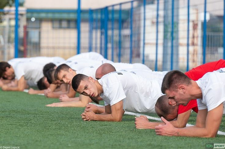
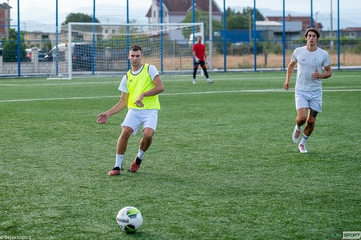
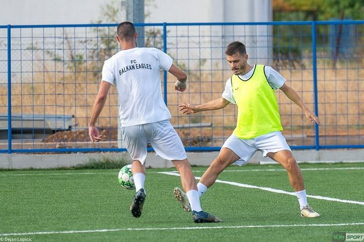
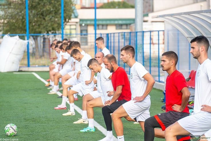
Seen above on the team's jerseys, the project's color scheme is a minimalist blend of strength, class, and maturity
The refreshing new identity is an empowering tool in the young yet determined—and quickly ascending—Montenegrin team's arsenal
#GoEagles
© 2024